“Great Art Does Not Require a Trail of Misery”
 AUTHOR:
Jess Berube
AUTHOR:
Jess Berube
Today is Tuesday, which may be no one’s favorite day of the week—and yet we’re here with two Very Important updates that are cause for celebration. Consider this our pitch to make Tuesday the new Friday:
Okay, the redesign process wasn’t dark, but it was long—like winter is for the polar regions or the Earth during an ice age. (Hey, we’re thespians over here! You have to expect some drama.) From budget planning to approval to process to launch, the full project took…a while. But going slowly meant we could be intentional, thoughtful, and data-driven.
We’re proud to share the result: a user-centric website that speaks to our industry audience by showcasing the core of who we are through copy, design, and digital strategy. And the best part? By sharing our process, we hope that you can find success in your website redesigns, too.
As digital marketers, we all know that websites are the digital lifeblood of our organizations. A well-designed, optimized website plays a crucial role in connecting with audiences and driving conversions. But did you know that a well-designed user interface can increase website conversions by 200% and better UX design can do so by 400%? How about that 94% of first impressions of businesses are design-related?
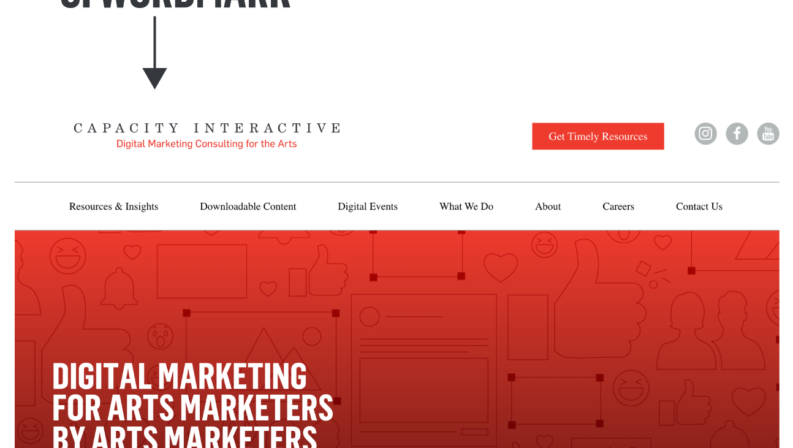
If you’re a longtime CI fan, you already know that CI’s former website left something to be desired. And you might even just now be understanding, for the first time, what it really is we do. That’s OK—one reason we needed a new site was because our old one just didn’t communicate the breadth of our work with our clients. Maybe you knew we helped arts organizations market smarter through digital advertising and free resources, but did you know we also provide content creation & strategy, email marketing, and more? As data-driven digital partners to arts organizations, clarifying and showcasing the ways we now serve the industry we love was our #1 priority with the new site, further solidifying ourselves as trusted advisors in the digital space.
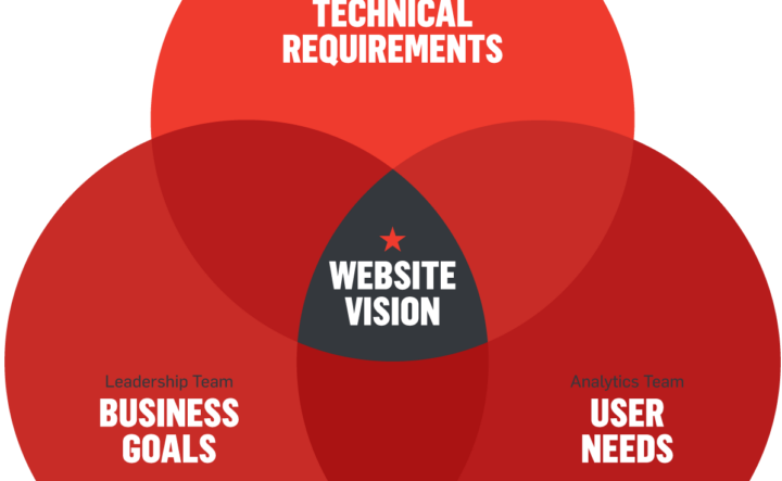
CI’s Primary Website Needs
The need to clarify our perception as industry experts was affirmed through a competitive analysis from Amy Jacobus Marketing. Website requirements, like a branded, visual site hosted on one content management system (the old site was built on two) were set by CI’s marketing team, and business goals were set by CI’s leadership. CI’s analytics team used behavioral data to inform and represent user needs. Altogether, these informed the pillars of our RFP, a few of which are highlighted below:
We help hundreds of arts organizations market smarter through holistic digital consulting and thoughtful resources that drive the arts forward. It was key to communicate what CI offers the industry and our clients in a clear, human way.
Our old website was “text on a page” with little to no discoverability features. We needed a seamless browsing experience with intuitive navigation and recommended content.
Marketers know the power of leads! The new site had to integrate more calls-to-action and showcase CI’s expertise through case studies—i.e. seeing our work in action, results first.
Brand matters—it tells our community who we are! Infusing thoughtful branded elements, striking arts visuals, and our incredible humans in the new website was critical. Our industry is stunning, why wouldn’t our site be?
Here’s how we made the transition, powered by blood, sweat, and tears GA4, an intentional approach to SEO, a strong brand ethos, and a partnership with an incredible design firm.
1. Identify Internal Stakeholders
We’d say that a website redesign is not for the faint of heart, but the truth is, a website redesign is for any heart that belongs to a digital marketer—it will come up again and again throughout one’s career.
The first step to any successful redesign process is assembling the right internal team (i.e. your stakeholders). CI’s redesign was managed and shepherded by Krisi Packer, former Senior Director, Marketing & Content, who liaised with key members of CI’s leadership for big-picture strategy, input, and approvals; CI subject-matter experts for thoughtfully incorporated analytics, SEO (see below), and Services content; CI’s marketing team for brand and content support; and our partner firm for every step along the way.
In creating your website team, identify “must have” POVs vs “nice to have” ones at each key stage. A website redesign process has a lot of moving parts, and if you wait for approval from every single stakeholder, your dream site will stay, well, a dream. The leader of your website project must be trusted, organized, and communicative. Set expectations with each stakeholder around checkpoints and establish trust that the project leader will loop key stakeholders in when needed or, if those folks are unavailable (take that PTO!), the leader will make informed decisions with the interests of each stakeholder, the goals of the website, and the goals of the company in mind.
Some say an artist is only as good as their tools and when it comes to a website, that’s true! Selecting the right partner firm makes or breaks getting the support you need and a result that’s worth the significant investment. After our site’s SWOT (strengths, weaknesses, opportunities, threats) analysis and content analysis, here are a few of the top needs identified for our partner firm:
After a series of interviews, CI solidified a partnership with the Seattle-based firm, Bilberrry. From the get-go, Bilberrry saw CI as the best-in-class digital destination for arts and cultural organizations, shared a collaborative and communicative working style, and had the technical expertise for custom solutions. For example, here’s a look at how they upgraded our CTA Generator…
…and our services pages. Our old site featured one page of copy; the new site has a detail page for each service robustly built with images, benefits-driven copy, data-driven case studies, and related content.
At CI, we always talk about making data-driven decisions—and those decisions couldn’t be more important than during a website redesign. Before making any decisions about your new site, look at your website data. Content migration is no small task, and you likely don’t want a 1:1 copy of your current content on a new website—we sure didn’t! Your data will inform what content is resonating with your audience (what you want to keep), what’s not worth your efforts, and how your navigation should work.
Website analytics are not just about looking backward—use them to look forward. There is a huge opportunity before a redesign to understand user behavior and how the current website is performing. It will ensure your time, efforts, and hard-fought budget for your redesign project aren’t wasted.
What data should you look at, exactly? It depends. GA4 has a TON of data, and you need to draw meaningful insights from it to strategically shape priorities. Remember: when there are too many priorities, nothing is prioritized. Use insights from your data to determine what will drive success.
What We Found in CI’s Data
In our redesign, CI’s analytics experts Yosaif Cohain and Ally Duffey Cubilette took a deep dive into CI’s old website data and found 3 key insights that informed our redesign:
1. Sessions were super short. 86% of visitors viewed just 2 pages or fewer! This raised the following questions:
These insights are what led us to identify where we could infuse more connective tissue with our content throughout the site. Now, we have thoughtful solutions we love like…
2. People came to CI’s site for expert insights. Our content analysis helped us understand which content users came for, how we could prioritize content migration efforts, which templates we should focus on, and what our ongoing content strategy should be.
3. We had to prioritize desktop over mobile. CI’s audience is arts marketers who mostly access our content and services during the workday. Case in point: we saw that 77% of sessions took place on a desktop. So while we still worked with Bilberrry for a flawless mobile experience, our priority for the UX was desktop-first.
Once we saw this data, we included it in the RFP so our design partners knew our objectives and could solve for them. (And remember, these results were for CI’s old website—the data will look different for you! If you want help drawing insights from your website data, talk to us.)
But the analytics work didn’t stop there—once the staging site was built, we needed new tracking solutions to make sure we could fully measure site performance from Day 1.
If you googled “how to finish a website redesign with all my brain cells intact,” consider the following advice your top result. It’s crucial to keep search engine optimization (SEO) top of mind during every step of the process. Why? A website is most at risk for losing its organic traffic and value—such as search ranking and link value, or authority built from high-quality backlinks—during a relaunch.
CI’s internal SEO conversations started about 6 months before launch and were guided by CI’s SEO experts Dan Titmuss and Alana Harper. Dan and Alana took the following steps to ensure CI’s new site SEO was strong:
1. Review 301 redirects: This first step is critical. We created a spreadsheet that detailed where key pages on the old website would be redirected on the new website. This ensured we didn’t lose hard-earned search traffic, so anyone who had an old page bookmarked still found our new one.
2. Set up Google Search Console: Google Search Console is a tool for analyzing organic search performance on Google. This helped us answer questions such as:
Once setup is complete, it’s important to check Google Search Console for crawl errors. After launching a new site, URL and site errors can prevent web crawlers from discovering some pages or even finding a website altogether. You will want to catch and correct these errors early to make sure your site continues to appear in search results.
3. Tag Builds and Keyword Research: We created title tags and meta descriptions for the top-performing pages on our site. This was informed by Search Console data and keyword research. Dan and Alana identified keywords that would capture upper funnel audiences—such as those looking for “digital arts marketing consulting firms”—and built those keywords into title tags and meta descriptions on the new site where appropriate.
While SEO is a critical part of website redesign before launch, it’s never too late—there are critical steps custom to each organization during the planning stage, pre-launch stage, and post-launch stage. If you want to know more, we highly recommend registering for Boot Camp 2023 On Demand to access Alana’s session, SEO for Website Redesigns: Your Roadmap to Increase Website Visibility, and/or working with Dan and Alana by connecting with us.
A website redesign offers so much opportunity for the newest, flashiest digital solutions, it can be tempting to go big and beyond your brand. CI has an established brand that we’re proud of, and we wanted solutions that elevated it on the website without reinventing it altogether. Bilberrry and CI worked together to deepen CI’s branding through copywriting, design, and content.
Of course, we aren’t just talking about the CI logo (although that was part of the conversation). As the American Marketing Association so eloquently puts it, a brand is a promise to your customer. For CI, we want our audiences to fall in love with that promise at first click, knowing who we are and what we’re about at a glance. After all, it only takes 0.05 seconds for users to form an opinion about your site that determines whether they stay or leave.
Our Bilberrry partners are also brand experts, so their interpretation of CI’s brand strategy and guidelines breathed new life into the systems we know and love. Here are a few ways CI’s brand was freshly incorporated throughout the site:
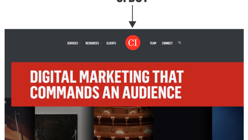
We swapped our featured logo. CI’s primary logo—our wordmark—lived on the old website. The new website features the “CI Dot,” the secondary but beloved little sibling to the wordmark. A central placement for the CI Dot in the header offers a friendly welcome to the site and a visual diving board for the bold “CI Red” content to follow.
We infused stunning photography. CI’s content champions inventive, custom illustrations (have you seen them in the Social Content Calendar for Arts Marketers?). We wanted a marriage of illustrations and photography on the new site for a more holistic view of our industry and our people—but how could we gather photo assets as a remote company? The solution: not-cheesy stock photography and an internal task to our team to document trips to industry conferences, local get-togethers, and of course, CI’s annual Boot Camp. We especially love how this solution brought our team page to life in a way that showed our connections with each other and with the arts:
We created new content to show—not just tell. Our new site’s exciting services pages feature carousels that highlight the nitty-gritty digital benefits of our partnerships. But what do those benefits look like in action? While Bilberrry honed in on overall site design and copy, CI’s marketing team crafted content for carousels, like this preview of a personalized dashboard our email clients receive:
No website is “set it and forget it” after going live with a redesign—all sites are iterative. For CI, our immediate post-launch steps involved a soft launch to catch small bugs, monitoring site performance through analytics, and finalizing design tweaks.
In the end, the long winter of our redesign process gave way to a new season for the CI site—one that we love! It was a team effort, for sure, and we’re grateful for the experience and the opportunity to share the learnings with our industry.
Let’s collaborate to set you up for success! We’ll help you get the data you need for a successful, smooth website transition, starting with cultivating meaningful insights from your website data to custom GA4 tracking to thoughtfully folding in SEO so you maintain your hard-earned organic traffic and value.
It all starts
with a conversation.