How We Helped MPAC and OSF Collect and Act On Data with Email Dashboards
Services We Provided:
Email StrategyWhen we’re working on any kind of project, our goal is to be as tailored to our client’s needs as possible. And, as always, we want to provide analysis, recommendations, and solutions that are fully data-driven.
Setting up custom email dashboards builds on both of these principles: we have a thorough discovery process to identify organizational goals and KPIs, some of which might be specific to the organization and how their season is constructed, and some of which might be specific to their email service provider (ESP) and what it offers.
Then, we pull data into Looker Studio from multiple sources (often, the ESP and Google Analytics at a minimum) to provide the most complete possible view of how email, as a channel, is performing.
Measuring overall month-over-month performance
We often focus on tracking trends across click rate and open rate, measured against important contributing factors like average list size and count of emails sent. We’re also pulling in revenue and conversion rate from emails sent in a given month from Google Analytics.
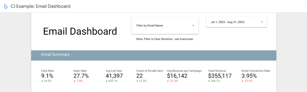
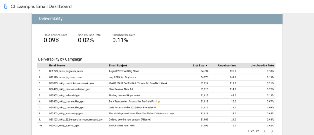
One might also want to look at deliverability stats: unsubscribes, soft bounces, and hard bounces.
In action:
For CI client Mayo Performing Arts Center, July 2024 saw a decrease in CTR across emails, but also an increase in average list size. Seeing these stats side by side indicated to the team that the CTR decrease was likely related to fewer targeted/triggered emails being sent that month, which tend to have higher CTRs given their higher relevance.
They also observed a month-over-month increase in soft bounces, which could be attributed to a summertime influx of vacation responders.
- Extra customization: Because Mayo uses the same UTM parameters for pre-show, post-show, and parking-related emails, these are separated out in their unique email dashboard so as not to double-count revenue based on those UTM parameters.
Measuring performance for specific emails
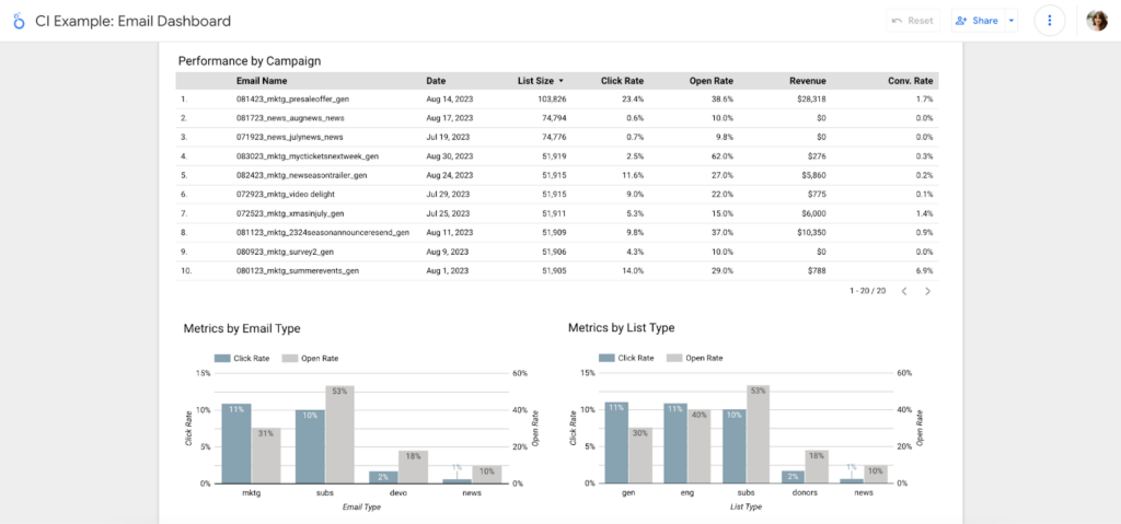
To drill down into specific content, the Looker Studio dashboard shows performance stats by individual emails as well as email types (e.g. preshow emails vs. fundraising emails vs. newsletters).
In action:
Oftentimes, we see different types of emails driving different KPIs. For Mayo, weekly newsletter emails typically drive quite a bit of revenue, but have relatively low click-through rates (compared to post-show and pre-show emails).
- Extra customization: Because Mayo uses Wordfly, email types can be easily analyzed in a Looker Studio bar chart based on Wordfly’s “Labels.” For Oregon Shakespeare Festival (stay tuned for more on them!), using Prospect2, strictly following naming conventions is critical for this piece of analysis.
Sales data: demystified!
While overall revenue trends are incredibly valuable in their own right, integrating the email data with GA4 data allows these Looker Studio dashboards to drill down into product-specific performance.
This gets us an understanding of which products/performances are being purchased from a given email or campaign…
…or which emails/campaigns are driving purchases for a particular product/performance:
- Extra customization: This is a feature that we created specifically for Oregon Shakespeare Festival. Because OSF has a repertory season, they can’t always make easy assumptions around what shows are being purchased based on the calendar. This extra layer of data allows them to understand, on a show-by-show basis, how email content that is more general/broad performs compared to email content that is hyper-focused on that show.
Extra data, extra insights
A handful of additional dashboard features that both Mayo Performing Arts Center and Oregon Shakespeare Festival have leveraged for data and decision-making include…
Subject line analysis, in which filters can be used to look at similar emails within a given campaign to understand how the subject lines impacted performance:
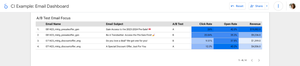
A/B test results, which directly compares the performance of A/B email versions that went to a split audience:
Website behavior, which looks at traffic from email in GA4 and can show site sections that people are landing on…
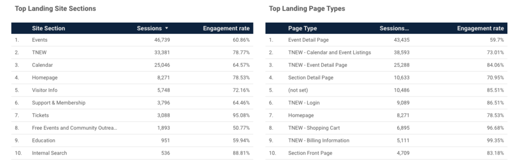 Example from Mayo
…as well as stats from other email sources (e.g. partners sending emails on an org’s behalf)…
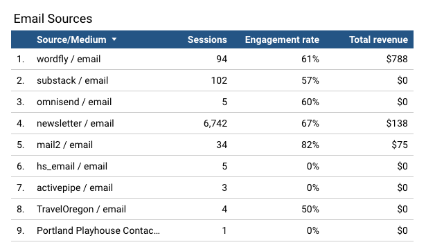 Example from OSF
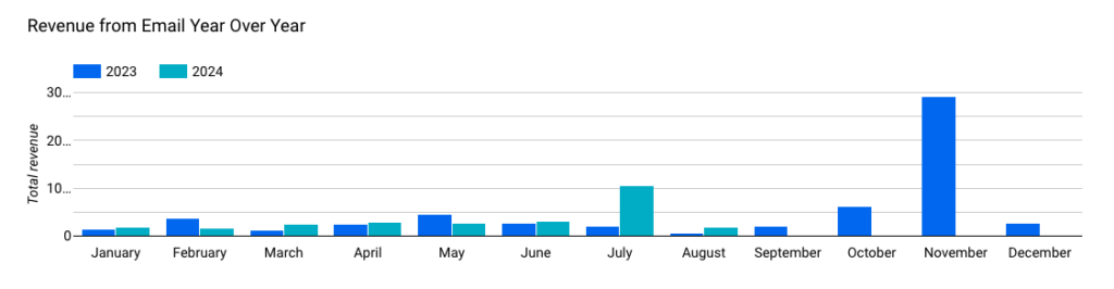
…and finally, year-over-year revenue trends on sessions generated by email:
Email dashboards = actionable data
With all of their email data in a consolidated, pared down, and customized dashboard format that integrates revenue data from Google Analytics, Mayo Performing Arts Center and Oregon Shakespeare Festival (among many other CI email clients!) have been able to stay on top of performance and make iterative optimizations to their email strategy.
Explore more

49% Average Click Rate
Boston Gay Men's Chorus